

Kioken Container Row Block is the block filling the biggest gap in Gutenberg, which is columns with extensive options. With the Container Row’s vast number of options, the layout possibilites are almost endless.
Create grid layouts, add borders to columns or the container itself(or both), or add parallax backgrounds both to the container and the columns. The features of the container row is way too crazy to explain in a single page!
Here’s a Wide Aligned Container Row:
Left Column:
Nullam placerat neque dolor, eu mollis massa accumsan in. Praesent eu ligula nunc. Morbi rutrum augue eros, fermentum dictum enim tempor dictum. Integer porta neque ac finibus iaculis. Aenean lacus urna, varius sit amet lectus non, vestibulum congue ante.
Nested Column
Nested Column
Right Column:
Nullam placerat neque dolor, eu mollis massa accumsan in. Praesent eu ligula nunc. Morbi rutrum augue eros, fermentum dictum enim tempor dictum. Integer porta neque ac finibus iaculis. Aenean lacus urna, varius sit amet lectus non, vestibulum congue ante.
Nested Column
Nested Column
Bust Out!
Whenever you need one of the columns stretch half of the screen in a 2 column layout, you can use the bust out ability for container rows.
This allows a centered layout having asymmetrical properties, which is cool!
Busted!
Whenever you need one of the columns stretch half of the screen in a 2 column layout, you can use the bust out ability for container rows.
This allows a centered layout having asymmetrical properties, which is cool!
Create Complex Layouts
This column falls behind the center column
This column also falls behind the center column!
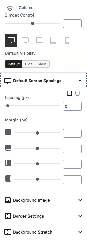
Adjust Spacings
Each row and column can have specific margin and padding values, responsively.
Add Overlays
Apply a color, background or gradient overlay with custom opacity and parallax options.
Adjust Alignments
Align columns vertically centered, or top/bottom, or change for each column.
Add Shape Dividers
Add stylish dividers to the top or bottom of the container row, or apply to both sides.
Apply Borders
Each row and column can have specific border width and custom radiuses.
Custom Colors
Apply custom text and link colors to be inherited by row layout content.
Shape Dividers!
Aenean lacus urna, varius sit amet lectus non, vestibulum congue ante. Nullam placerat neque dolor, eu mollis massa accumsan in. Praesent eu ligula nunc. Nullam placerat neque dolor, eu mollis massa accumsan in. Praesent eu ligula nunc.
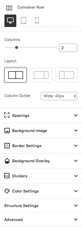
Container Row Settings
Each row block has numerous settings to make it responsive, functional and elegant. Here are only some of them:
Spacings:
- Padding and Margin for each side
- Responsive spacings for multiple device resolutions
- Predefined gutters, while custom gutter values also available
Background and Borders
- Border and border radius values for each corner
- Background image with overlay options.
- Each background has repeat, display, blend mode, image resolution, focal point position and parallax options
- Overlays can have color, gradient or background image with additional parallax properties
Shape Dividers and Structural Settings
- Choose from a list of 12+ shape dividers for top and bottom, adjust width and height(responsive overrides also available), and flip horizontal or vertically when needed
- Set minimum height for the container, or maximum width of the content for each container row
- Adjust vertical alignment for columns
Like What you See?
Get Bavarian WordPress Theme today and gain access to those amazing KiokenBlocks, since it’s currently only available with the theme!